


Having a great website is like owning a fabulous pair of shoes—they will help you look good, help you do your job, and they can go everywhere with you. But like a good pair of Louboutins, a good website is an investment. And, like a really hideous pair of white L.A. Gear high tops from 1995, a bad website can do more harm than good. So whether you are building your first website or due for a redesign of your current site, we’ve got a few tips to help you build a website that works for you.
The Customer is Always Right
The best websites do one thing exceptionally well: they give visitors what they came looking for—nothing more, nothing less. No one wants to waste 10 minutes of their time scouring your website for a contact email that’s buried in unrelated content or, worse yet, not there at all. No one wants to wade through pages of irrelevant content to extract a simple bio. Make your website about what your clients want, even if it’s not necessarily what you want. For freelance harpists, this means putting yourself in the shoes of the brides-to-be, event planners, and harp parents. Ask yourself why they came to your site.What are they looking for when they land on your homepage? Put that information front and center.
If people are coming to your website looking for a wedding harpist, make it clear you are their harpist by showing them what they are missing if they don’t hire you, with compelling photos, reviews, and audio or video samples.
If teaching is your website’s draw, then load up your site with teaching demos, testimonials, photos, and contact information. Maybe visitors are scouting your site for a concert booking. Give them a top-notch media kit and a professional-looking website.
Getting a prospective client to visit your website is a big marketing win. You don’t want them to leave your website in frustration before they find what they are looking for.
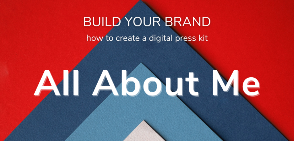
Digital Press Kit
Whether you are making your debut at Carnegie Hall or headlining the local library’s concert series, having a digital press kit available on your website is a marketing must. Not only will it make your life easier (no need to email a bio or snail mail an 8×10 glossy headshot), but it will save time for both your concert promoter and the press outlets that are covering your event. Having easily-accessible press materials can mean the difference between getting a one-line mention in an events calendar and being the featured event in a news outlet’s arts section. A reporter or promoter can fish around different pages of your website for the materials they need, but they won’t. They don’t have time. Give them a one-click stop for all of the information and images they need.
At the very least, your website’s digital press kit should include photos and a brief bio. If you have good quality video clips, audio excerpts, and press reviews, then include those as well. As with every other element of your website, chose quality over quantity. One or two recent professional-quality photos are preferable to an entire album of grainy photos from your “bad perm” era. Make your photos available for download as both high-resolution and low-resolution images. (If you are unsure about the difference between high- and low-resolution see the explanation in the sidebar.)
Notice that we used the adjective “brief” when describing the type of bio that should be included in your press kit. This goes back to giving your visitors what they want, not what you want. Most will not take the time to read a bio longer than two or three paragraphs. Think, “Just the facts, ma’am.” If you can’t resist the temptation to give your website visitors the type of detailed recap of your life that would make Jane Austen proud, just be sure you also include the Cliff’s Notes version, and label the files accordingly (i.e. brief bio and full-length bio).
Video, audio, and press review clips are nice to include if you have good material, but it’s better to go without than to use sub-par content.
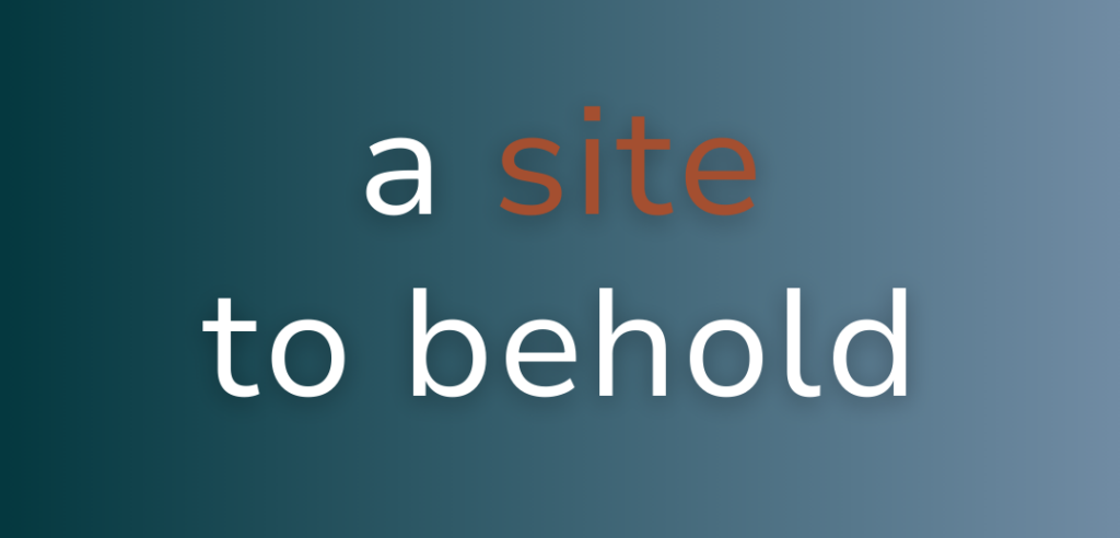
Good Art
Pixel Party
To make sure your photos look good both online and in print, it’s important to understand image resolution. High-resolution images have a standard resolution of at least 300 dpi (dots per inch). Print publications require high-resolution images. Low-resolution images, have a standard resolution of 72 dpi. Low-resolution photos, like the one below, are suitable for the web, but will not work for print. Download this issue to see an example of what this image looks like printed at both high and low resolutions.

You don’t need a bunch of photos to build a visually appealing website, you need a few really good photos. I know we just mentioned the importance of quality photos over quantity in digital press kits, but this point can’t be stressed enough when it comes to the photos you use on your website.
Here are some tips for choosing and editing your website photos:
Recent: When you show up at your gig, the client should be able to recognize you from your website photos. If they can’t, it’s time for new pictures. New photos can be a big expense, but there is almost no better investment you can make in your overall marketing plan than top-notch photos.
Simple: Your harp doesn’t need to appear in its entirety in every shot. You can skip the harp altogether in some photos if you want. Don’t be afraid to crop. Close-up shots of your hands, still life photos of your instrument or the music on your stand can work beautifully.
Stock: Get in the habit of taking a few shots of your harp at every event you play from artistic perspectives with your phone. Every once in a while, you will get a winner that you can use on your website. Also, don’t be afraid to fill out your web pages with stock photos. Many decent quality stock photos are available free online, and if you want to shell out some money, you can pay for really high-quality images.
Keep it Fresh
Ever wander into a restaurant on a Saturday night and stop dead in your tracks when you see that only one of the tables is filled and the place is so quiet you could hear a pin drop? What do you, the prospective customer, do? You turn right around and walk out. No one wants to hang out in a ghost town. Clearly there is something about the place that is keeping folks away, and you don’t want to stick around long enough to find out what it is.
Visiting your website is like walking into a new restaurant. If you want people to stay and look around, you have to keep the content fresh and current. A news page with no updates since 2011 or a calendar page with no events listed for the next six months isn’t exactly a ringing endorsement for your services. If you don’t have a steady stream of news to post or events to fill the online calendar, don’t worry. You don’t have to include those elements on your site. Instead, try a blog. You can update a blog regularly with timely events and news, as well as posts about broader topics that aren’t as time sensitive.
Video
Embedding video on your website is easy and it can be a powerful marketing tool if it’s done right. The video clips don’t need to be long, in fact, shorter is better. Most visitors to your website won’t sit through a 15-minute concerto performance but will be impressed by a 30-second clip from the cadenza. Go for quality over quantity. A video clip from an opulent wedding or a concert at an iconic venue helps potential clients see what their event could look like if they hire you. Just make sure you give your website visitors a choice of whether to view the video or not. Don’t automatically launch the video (or audio) when a user lands on the page.
Social Media Integration
Love it or hate it, social media gives you a big audience for your message, so it should be a component of every musician’s website marketing strategy. Integrating social media platforms with your website helps you make the most of the wide audience you get on social media and the custom look and message of your website. Linking the two is as simple as slapping up a “find me on Facebook” link or as slick as having your Twitter feed or Sound Cloud account update in real time on your website’s home page. Build in sharing icons so users can like or share your website content on their social media pages. You can make social media as large or as small a component of your website as you want, but there is no denying that social media is one of the most cost-effective ways to get your message out. If you aren’t cross-promoting your website and social media accounts, you are leaving money on the table.
Merch
There is no question selling your merch is more cost-effective online than it could ever be in a brick and mortar store (just ask Amazon), but you might not be ready to open the can of worms that comes with adding e-commerce to your website. Even if you don’t want to sell your CDs or arrangements directly from your website, have a page to display them and easily link users to a third-party vendor.
Your Look
Your website should be a digital reflection of who you are as a musician. That means coming up with a look that is you. If design isn’t your forte, invest in a professional to help. Tap into the talent of someone you know, or use one of the online design service sites. Websites such as DesignCrowd, crowdSPRING, and 99designs offer graphic design with a crowd-sourcing model. You tell them what you want and a bunch of freelance designers take a crack at it. You pick the one you like. You will spend at least a hundred dollars for your logo, but the quick turn-around time and selection are worth it. Other sites like Fiverr, oDesk, and Elance allow you to find a designer you like and hire them directly. You can build your website’s look from that logo, which can drive your choice of fonts, colors, and overall tone.
Mailing List
Even if you have no news to share, encourage visitors to sign up for your email list. Then when you decide to put together a little concert tour next year or try a Kickstarter campaign for a new album, you’ve got a good list of addresses from which to build. A form for users to fill out to be added to your email list is simple and can be added to your contact page or on the footer or sidebar of your homepage.
Less is More
Make your website simple, keep it uncluttered, and stay on-message. These sound like no-brainers, but it’s easy to fall into the “just one more thing” trap—just one more photo, just one more paragraph, just one more video. Pretty soon you’ve got rambling, unfocused website that isn’t working for you. Define your message, and stick to it. If visitors have to wade through a bunch of content they don’t care about to find what they need, chances are they will abandon your site. Web users’ patience is short, especially when other options are available with a simple Google search.
It’s Not Your Everything
If you’ve built yourself a top-notch website, it might be tempting to sit back and relax, thinking your work is done. Don’t let your website be your entire marketing plan—even the best websites can’t do it all. Think of your website as your showroom salesman. It can show your best face and make a convincing pitch for you, but it still doesn’t get people in the front door to look at you, and it doesn’t close the deal. You need a comprehensive marketing strategy to drive potential clients to your site and to book you once they are in the door. Those are topics for another article, but if you can execute an effective website, you will be well on your way to being a marketing mogul. •